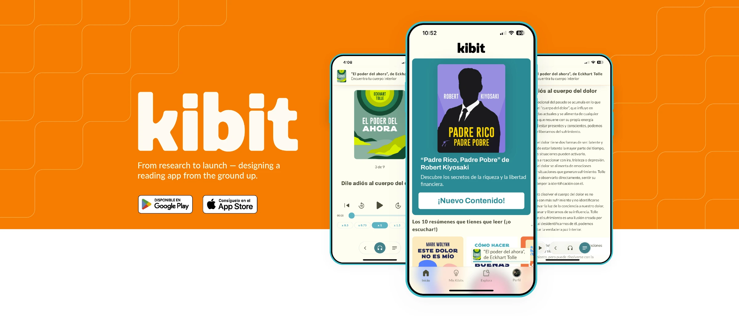
Kibit — Big ideas, in minutes
From research to a shipped subscription app, designed from a blank page.
Context & challenge
The challenge
Kibit is a reading and personal-growth app — book summaries you can finish in about ten minutes, built from short modules, key facts, audiobooks, and expert-curated plans. (The name comes from “key bit”: the essential piece of information.)
The company behind it came from the VAS world — value-added services billed through carrier portals. Kibit was its move into a completely different model: a real app, in the stores, with subscriptions, acquisition campaigns, and ASO. The challenge wasn’t just designing screens; it was designing a product for a business model the company had never operated in before.
Objective
The objective
Define and design Kibit from a blank page: validate the niche, shape an MVP, and deliver a launch-ready product that could compete in the app stores and convert through a subscription funnel.
- Validate the niche — confirm the opportunity and positioning.
- Shape an MVP — define scope from the ground up.
- Launch-ready product — built to convert through a subscription funnel.
The solution
A focused reading experience, built to convert
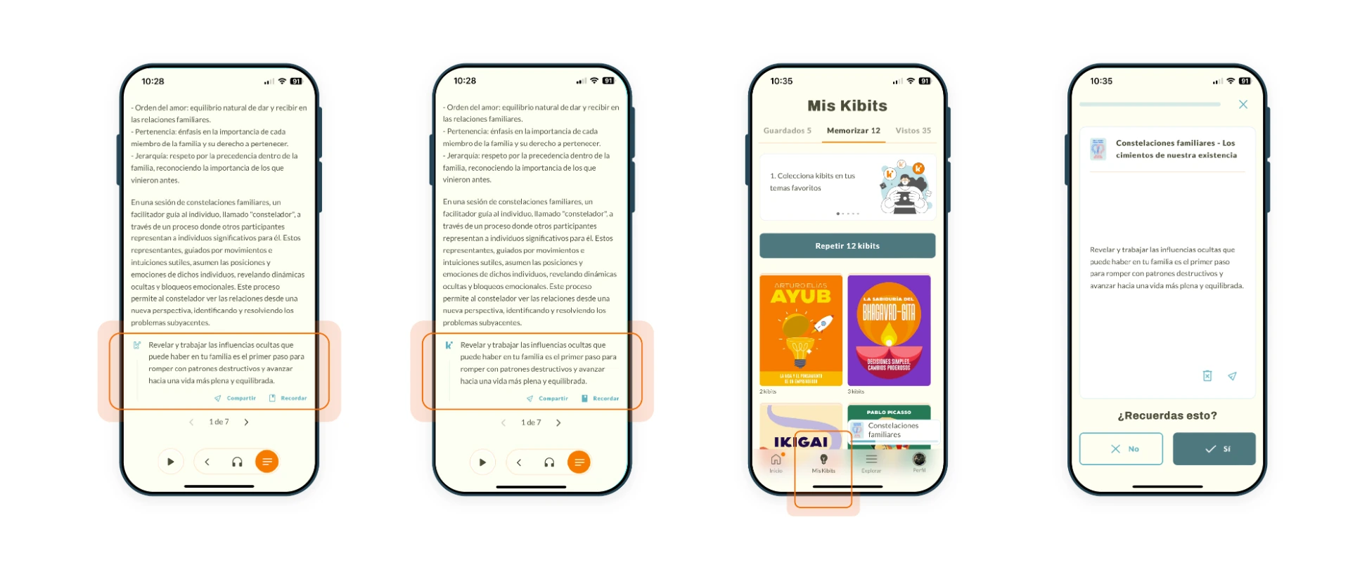
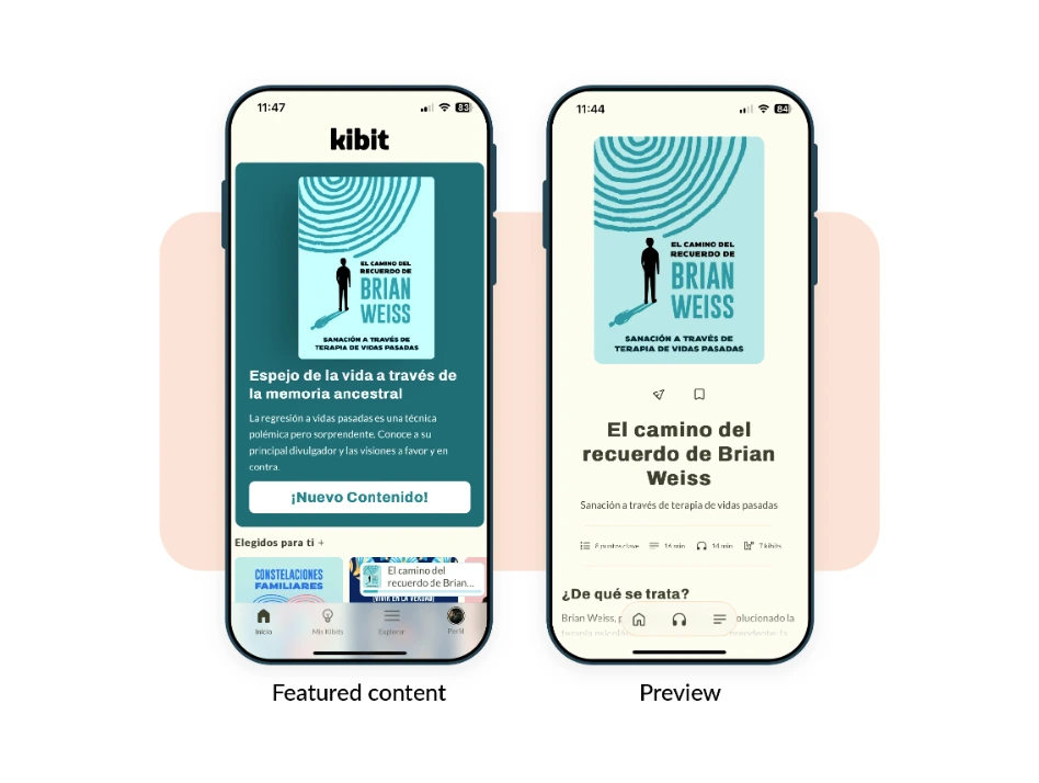
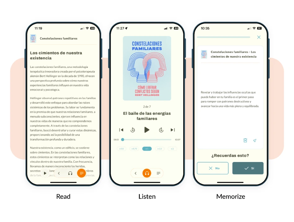
A focused reading experience built around short, memorable “kibits,” with personalized learning plans and a clear path from first session to subscription. The product launched on both the App Store and Google Play.
Visual identity & assets
A cohesive visual system
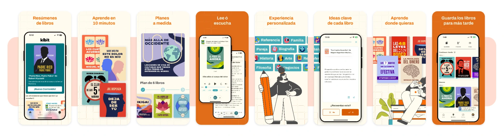
Beyond the screens, I shaped Kibit’s complete visual identity: a scalable design system with reusable components and modals, plus a custom set of assets — avatars, illustrations, and store visuals. This kept the product consistent as it grew and gave the brand a distinctive, cohesive look.
Paywall system
Designing the paywall system
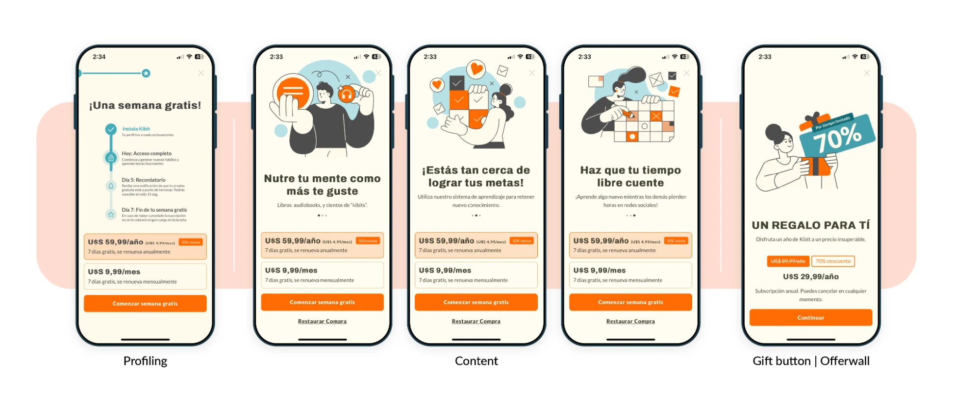
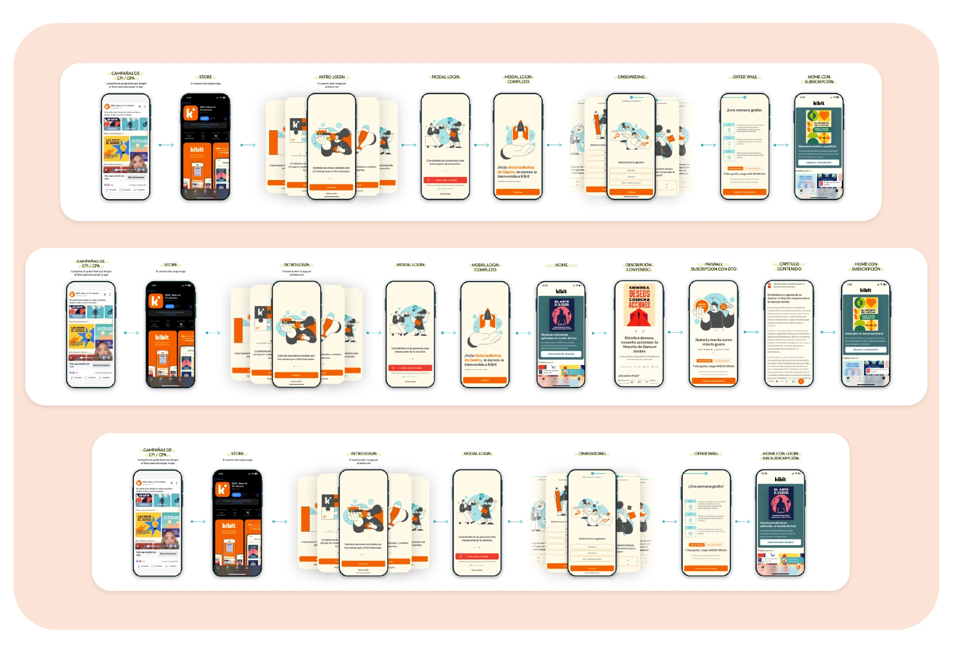
I designed Kibit’s paywall system — a single visual family adapted to different moments in the funnel, each with its own pricing logic and messaging. The onboarding paywall introduces the free-week timeline after profiling; the content paywalls use emotional, benefit-driven copy to convert during browsing; and the gift offer wall presents a special discounted annual plan. Same look, different conversion strategy at each touchpoint.
Role & responsibilities
I led UX and UI across the full product lifecycle
UX research
Defined the niche and benchmarked competitors (Blinkist, Headway, Wiser) to position the product.
MVP definition
Shaped the product proposal and scope from the ground up.
User flows & wireframes
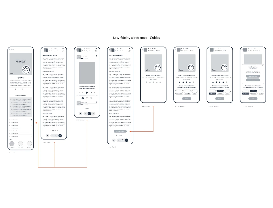
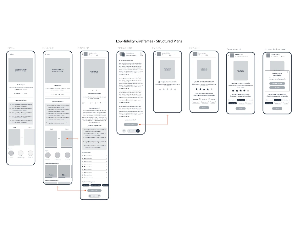
Designed the interaction architecture and low-fidelity flows.
High-fidelity UI
Delivered the full visual design, launch-ready.
Store assets
Designed the product-page screenshots and visuals for the app stores.
UI, design system & assets
Designed Kibit’s full visual language: UI components, modals, a scalable design system, and custom assets including avatars and illustrations.
Paywall system
Designed a coherent set of paywalls with distinct pricing and messaging across the conversion funnel.
Process
From research to a monetization journey
The groundwork behind the product — a competitive analysis to position Kibit in a crowded category, and a mapped user journey toward subscription.
Acquisition flow
Outcome & design goals
Shipped to both stores
Kibit shipped to both app stores — the company’s first product in the subscription-app model. The design was built around clear success criteria.
Acquisition
Through ASO and acquisition campaigns.
Activation
Hooking users in the very first session.
Conversion
Through a time-limited subscription funnel.